Shankar's Personal Website. Built in March 2024.

May 8, 2026
Type Design Diary - entry#1
My exposure to type thus far was limited to setting type for design systems and interfaces, along with some light lettering as a hobby. I love typography and I have been itching to dip my toes into the world of typeface design.
This February, I decided to take the plunge and signed up for a fundamentals course with Cooper Union to understand the principles of typeface design.
This course taught me what goes into designing a typeface—i.e., the A to Z of the process. I am not even done with my font yet, but I learned a lot about this unique and fun field of design.
Here are some notes on my learning experience as a newbie getting into typeface design:
Type design takes patience
Granted, you could say this about any craft, but typeface design requires a lot of patience when tweaking letters. What looks great when zoomed in looks like a runny egg when typed out at 24pt size. Drawing a letter (even a simple one) takes a lot of time to get right.
Calligraphy
My instructor told me that calligraphy is an important skill for typeface designers. Making a mark by hand influences the strokes quite a bit. Understanding things like interrupted and running letters goes a long way towards nailing the style when making the letters digital. That being said, I also learned that calligraphy is important, but not mandatory, to make great typefaces. I am going to practice calligraphy as I go deeper into my journey.
Expansion and translation
Expansion refers to the pressure of the nib, while translation refers to the angle at which you draw the letter. At this point, I vaguely understand the basics of calligraphy but have a long way to go.
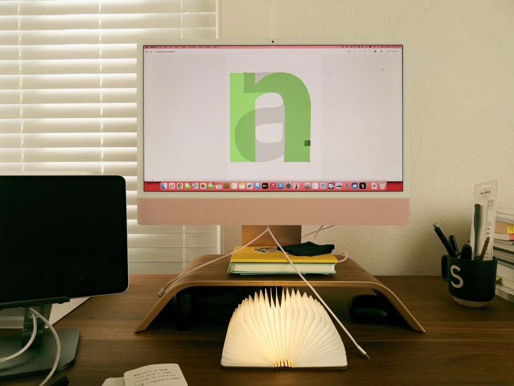
Draw those control letters well
Control letters like H, O, n, and o help form the basic rules for a typeface. For example, drawing a lowercase “n” first made it easier to draw a lowercase two-storied “a”.
Mastering the pen tool is a must
The pen tool is a staple tool in most graphic design programs, but I don’t use it often in interface design. In typeface design, the pen tool is front and center—simple shapes take a backseat and are only there to help get started. You actually need a plugin to get a rectangle tool for RoboFont!
RoboFont
For someone who works out of Figma every day, RoboFont has a hell of a learning curve. Like, super steep. It is super minimal and super hard. But once I got into the rhythm, I started enjoying it. To focus on one letter at a time is so therapeutic!
Layers and components!
Layers exist for a totally different reason in RoboFont when compared to apps like Figma or Sketch. Once I understood that, I was able to bring in my control letters as a layer into other letters. For example, lowercase “o” was a background layer when drawing lowercase “c” and “e”. RoboFont also has components, which come in handy when making diacritics. Ooh, I sound so fancy.
What’s next?
I don’t know yet. I have a few online courses bookmarked that will help me practice further. For the next year, my goal is to practice and eventually publish a full typeface. Maybe I will publish my font on Google Fonts someday?